
Accessible "Read More" links
"Learn More" Links are part of a pattern we see in Blogs. The design has the title first, then a content excerpt and a text link that takes us to the post page with the full content.
Blogs have an index page with a list of posts that makes it easier for the general public to choose what to read. This is simple enough the general public, but it gets complicated with people with disabilities. In this specific case, people that use screen readers.
The fix for this issue is so simple, yet I see it everywhere, on big company websites or simple personal blogs.
Before I started writing this post, I checked ten blogs—some of them with an excellent reputation—and eight had an inaccessible “Read more” link.
How can we know if a “Read more” link is inaccessible?
Screen reader usage
Screen readers generate a list of links without context to help the user map the content of the page. Also, screen reader users usually navigate a page by using the tab key to jump from link to link without reading the content. So you can expect that having a list of “Read more” links is useless and adds redundancy in this context, e.g.,
|- Title for a blog post
|- Read more
|- Title for a second blog post
|- Read more
|- Third blog post
|- Read more
|- Another blog post
|- Read more
Also watch “Screen reader demo: don't use 'click here' for links” in YouTube
Real world examples
Let’s see some examples and inspect the code they use.
Example 1
In this example, the link is a big button acting as a call to action, but the button by itself is lacking context. Continue reading… what?
<div class="ft-morelink clearfix">
  <a href="#">
    Continue Reading
  </a>
</div>
Example 2

In this example we have something similar, but with a twist. We have markup with the right intention to show some text to screen readers, but it’s used wrong.
In this example we have something similar, but with a twist. We have markup with the right intention to show some text to screen readers, but it’s used wrong.
The span element you see with the class screen-reader-text is supposed to be used as an alternative text for screen readers. That part of the HTML should have meaningful text like “Read More about free duotone photoshop gradient presets.” But, even if it had it, the screen reader would read both parts, adding redundancy and confusing the user.
<a class="btn btn-default" href="#">
  Read More
  <span class="screen-reader-text"> Read More</span>
</a>
Example 3
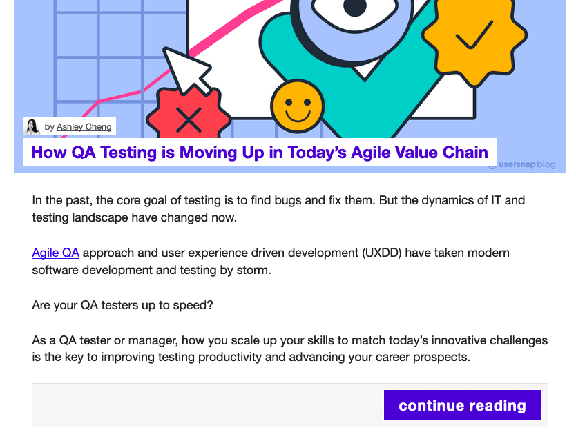
We are very close! The developer used the title attribute to add an alternative text to the content inside the link. Unfortunately, the title attribute is not accessible for everyone.
<a
  href="#"
  title="How QA Testing is Moving Up in Today’s Agile Value Chain"
  class="readmore button"
>
  continue reading
</a>
Solutions
In these examples, we have user interface helpers to make it easier for the general public to access the content, but for screen reader users we are adding redundancy by having a useful link and a link without context reading “Read More” or “Continue Reading.”
No more read more
There are a few ways to improve this. The first solution would be to remove the “Read more” link altogether, the way A list Apart and David Walsh do it. For me, this is the best solution, we remove duplicated code, redundancy, and keep the user interface concise.
But there are a few solutions in case you want to keep your “Read more” buttons.
Meaningful text link
One solution is to keep the “Read more” link but add descriptive keywords or context to the link. Instead of having just “Read more,” you would do something like:
<a
  href="/everything-you-need-to-know-about-date-in-javascript/"
  class="read-more"
>
  Read Everything You Need to Know About Date in JavaScript
</a>
With this fix, we attach meaning to the screen reader users, but we hit another issue, we added redundancy to the general public. Also, the link is way too long.
The aria-label attribute
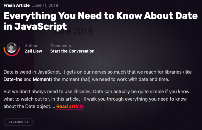
The optimal solution, in my opinion, if you want to keep the “Read more” link, is to keep the text short but add a meaningful ARIA label describing the action in the link.
This will announce to the screen reader exactly where the link will take them.
<a
  href="#"
  aria-label="Read Everything You Need to Know About Date in JavaScript"
>
  Read article
</a>
We keep the link short and concise for both general public and screen reader users by removing redundancy in the text and make it explicit with the ARIA label.
Conclusion
If you can, remove the “Read more” link and keep the heading or title of the post as the primary link, if you must have the “Read more” link for any reason, use the aria-label attribute to add context for screen reader users.
These changes might look like nitpicking, but these small improvements are a huge help with people that use assistive technology. It doesn’t take much time to do it, and the benefits are worth it.